Branding | O'Charley's
y’all ready for more?
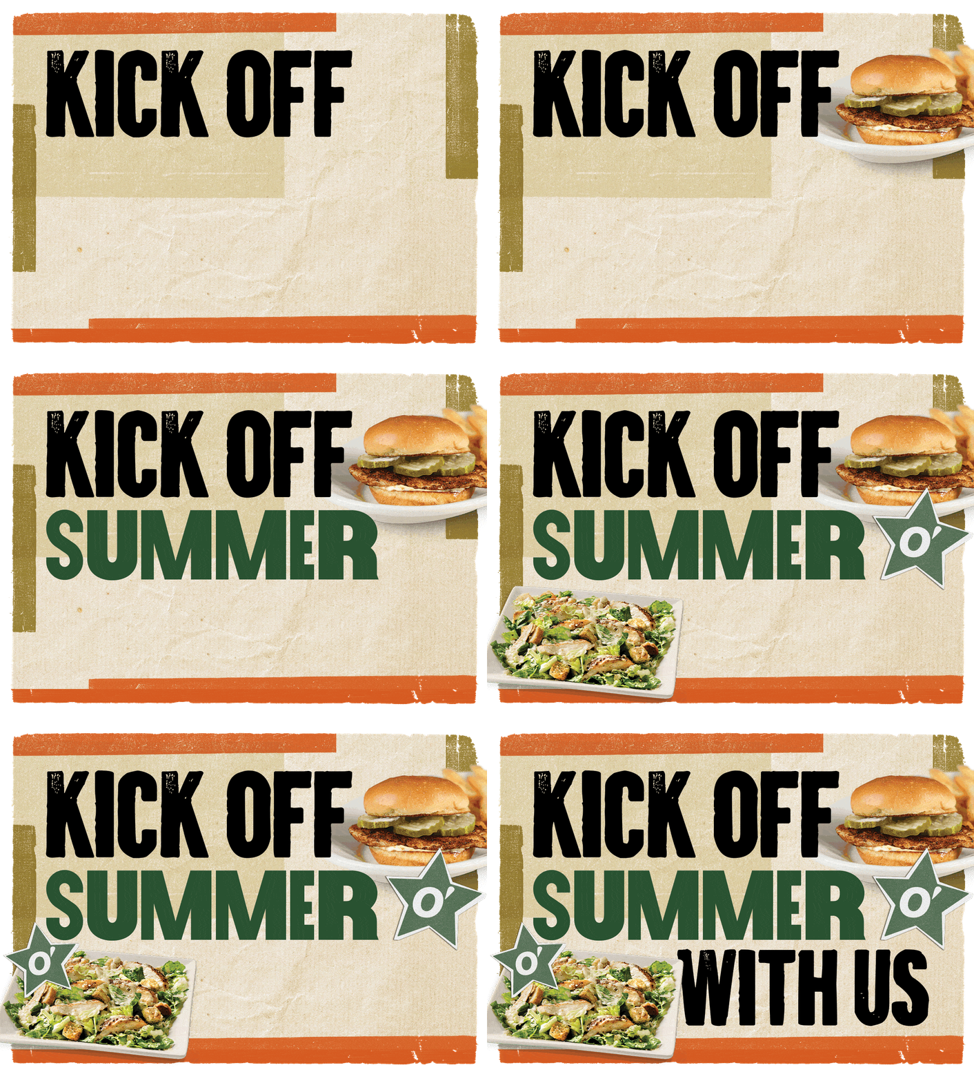
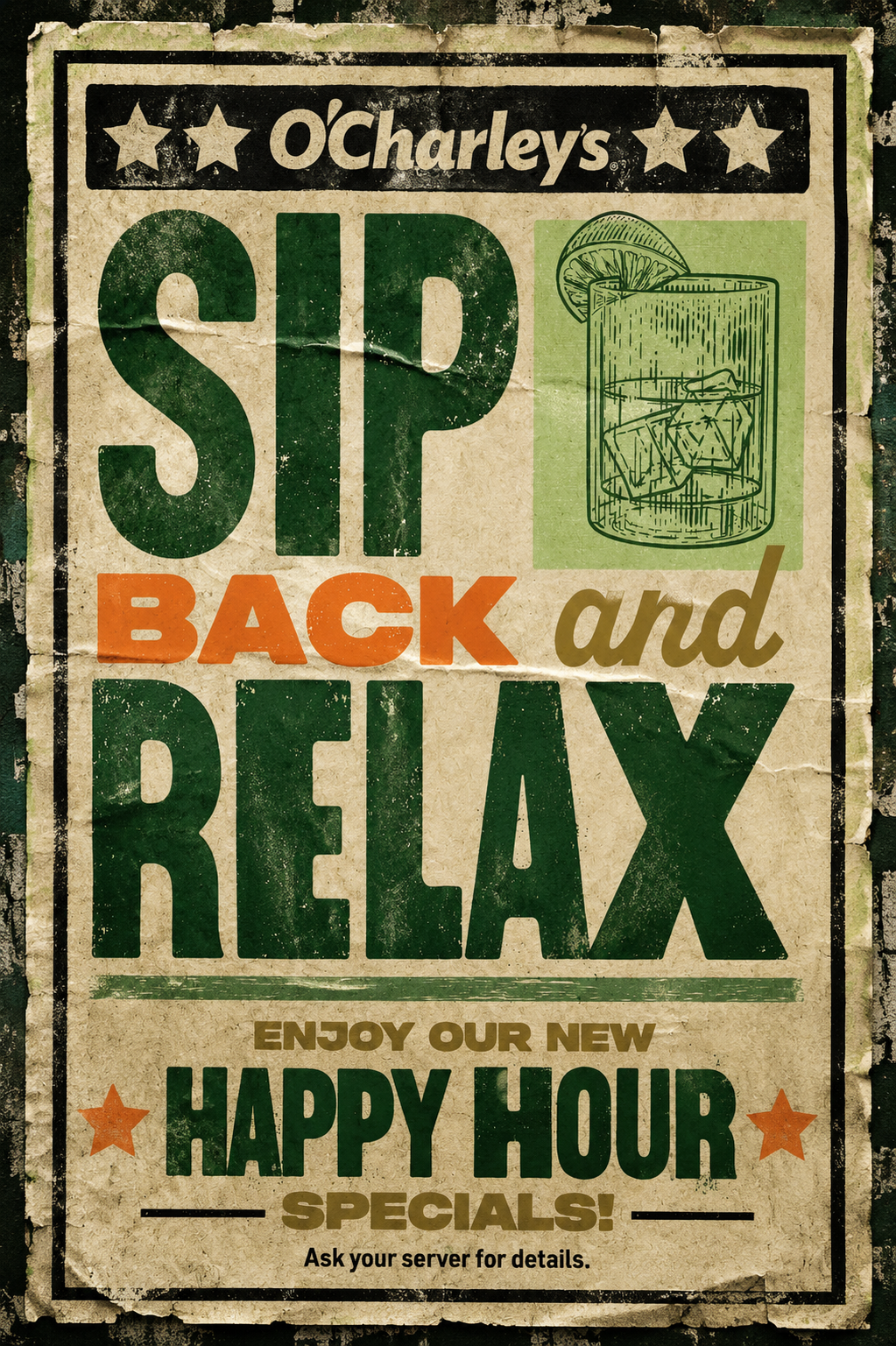
Fast casual dining restaurants are constantly competing for attention in a drastically different market than just five years ago. Rather than chasing trends, we looked back at what the O'Charley's brand already owned — Nashville roots. That became the basis for a refreshed brand direction inspired by Nashville's iconic Hatch Show Print design aesthetic and the energy of a night out in Music City. We developed messaging and graphics that connected going out to dinner with going out to a show, creating a campaign platform that felt familiar but had a vibrant personality. The visual identity followed with a refreshed logo treatment, vintage-inspired typography, muted color palettes, gritty textures, and hand-drawn illustrations that came together as a flexible brand system we could extend beyond a single campaign.
The Fix:
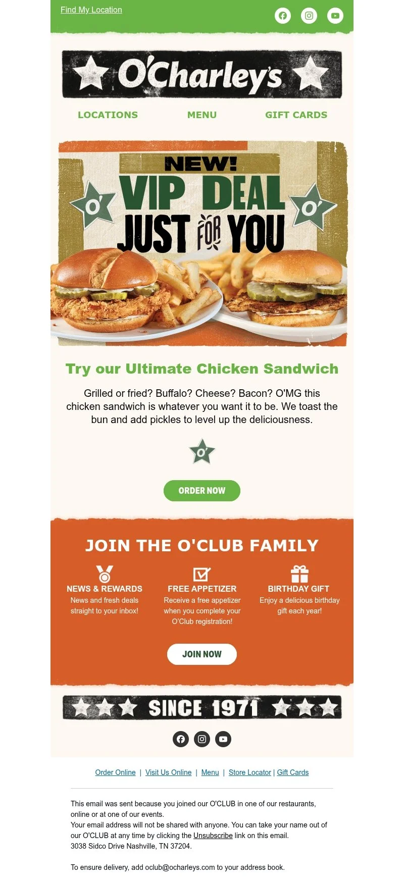
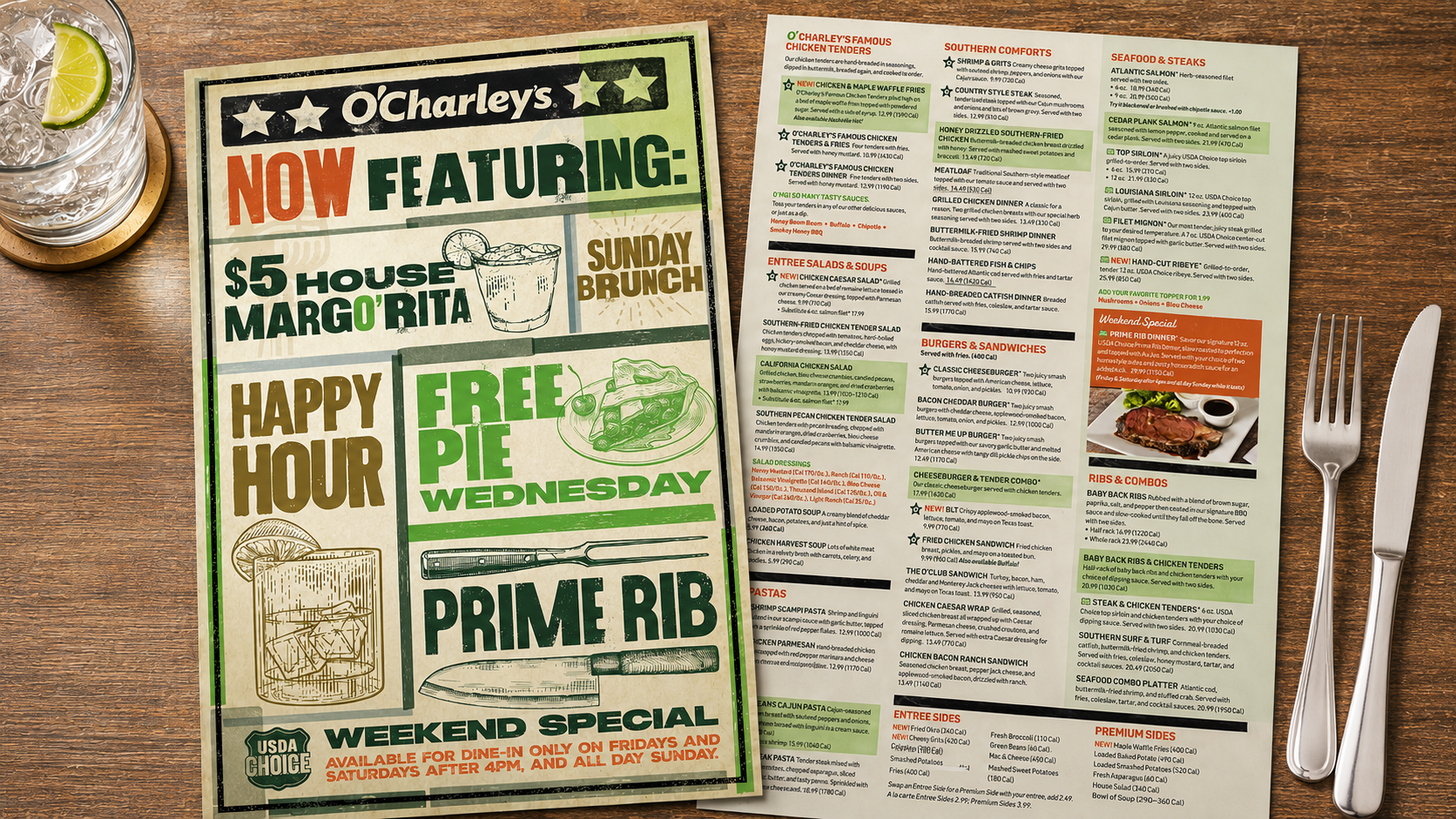
From menus to email campaigns, in-store signage, and CTV, the refreshed identity gave O'Charley's a more ownable voice while creating a cohesive experience across every customer touchpoint. And to top it off, it encouraged customers to go out and dine in again.